How can you tell if a household is on vacation from smart meter data? Easily, just take a look and it’s pretty clear. But what if there are hundreds of households? Thousands? Millions? In this blog we’ll go through a methodology for identifying “outlier” days in smart meter data.
Methodology
We’ll use k-means clustering to identify outlier days, and filter them out – this gives us a true picture of a houshold’s “typical” consumption. This method assumes that people consume electricity differently when, for example, they sick at home, or that a household consumes no electricity when the occupants are away on holiday. I believe these sorts of assumptions are reasonable. For the case of a two week holiday, imagine a flat-line electricity consumption profile compared against a normal day. The holiday usage forms quite a distinct cluster, however, because it is only present for a couple of weeks, we can discard it. We are then left we the remaining days which will be more representative of the household’s usage.
Code
We’ve covered the following code in the last post (link) so we’ll skip through it here:
library(dplyr)
library(lubridate)
library(tidyr)
library(readr)

url <- "https://files.datapress.com/london/dataset/smartmeter-energy-use-data-in-london-households/Power-Networks-LCL-June2015(withAcornGps).zip"
download.file(url,destfile = "data/data.zip",mode = "wb", method="wget")

# Or if you've saved it
# df <- read_csv("data/data.csv")

uk_holidays2013 <- ymd(c('2013-01-01','2013-03-29','2013-04-01','2013-05-06',
                         '2013-05-27','2013-08-26','2013-12-25','2013-12-26'))
df <- df %>%
  transmute(ID = LCLid,
            DateTime,
            kWh = `KWH/hh (per half hour)`,
            Mnth = lubridate::month(DateTime)) %>%
  filter(DateTime > ymd('2013-01-01'),
         DateTime <= ymd_hms('2014-01-01 00:00:00')) %>%
  distinct() %>%
  group_by(ID) %>%
  filter(n()==17520) %>%
  mutate(DateTime = seq(ymd_hms('2013-01-01 00:00:00'),ymd_hms('2013-12-31 23:30:00'), by = 1800)) %>%
  ungroup()

df <- df %>%
  transmute(ID,
            DateTime,
            kWh,
            Mnth,
            PHol = if_else(date(DateTime) %in% uk_holidays2013,TRUE,FALSE)) %>%
  filter(!wday(DateTime) %in% c(1,7),
         Mnth %in% c(11,12,1,2),
         !PHol) %>%
select(-Mnth, -PHol) |
Let’s look at one household’s daily usage profiles. We will normalise it such that the area under each of the lines will equal one.
We will also slightly smooth the lines so they are more pleasing to the eye.
library(ggplot2) df %>% filter(ID == 'MAC000010') %>% mutate(Day = rep(1:83, each=48)) %>% group_by(Day) %>% mutate(n_kWh = kWh/sum(kWh)) %>% ggplot(aes(y = n_kWh,x=rep(1:48,83),group=as.factor(date(DateTime)))) + stat_smooth(method="loess",se=FALSE, span=0.2, geom="line", alpha=0.1) + labs(x = "30 minute period of day", y = "normalised kWh") |

Let’s see if we can identify some clusters in this profile. We first need to widen our data frame so our clustering algorithm can understand it. Remember: ggplot likes long data, machine learning needs it wide.
norm_wide <- df %>%
  filter(ID == 'MAC000010') %>%
  group_by(ID) %>%
  mutate(Day = rep(1:(n()/48), each=48),
         Period = rep(1:48, n()/48)) %>%
  group_by(Day) %>%
  mutate(n_kWh = kWh/sum(kWh)) %>%
  ungroup() %>%
  select(n_kWh, Period, Day) %>%
spread(key = Period, value = n_kWh) |
We’ll now have a column for every 30 minute period of the day, and a row for every day. This allows a clustering algorithm to find those periods (columns) amongst the days (rows) that are similar (clustered).
| Day | 1 | 2 | 3 | 4 | 5 | ... |
|---|---|---|---|---|---|---|
| 1 | 0.017485896 | 0.008852040 | 0.006296169 | 0.007418259 | 0.005984478 | ... |
| 2 | 0.006172438 | 0.007666818 | 0.007569359 | 0.005750114 | 0.006399844 | ... |
| 3 | 0.007922123 | 0.005525023 | 0.006372778 | 0.006898971 | 0.005086529 | ... |
| 4 | 0.023694000 | 0.008868403 | 0.008086689 | 0.006846730 | 0.006038061 | ... |
| ... | ... | ... | ... | ... | ... | ... |
Now we can invoke the base R kmeans clustering algorithm to identify the rubbish outlier days.
clusters <- norm_wide %>% select(-Day) %>% kmeans(7, iter.max = 100) |
Feel free to play around with the k-means parameters, I’m not going to dwell on them in this post since this sort of thing is quite well covered on the Internet. We can visualise these clusters, we’ll need to return the data to long format:
norm_long <- norm_wide %>% mutate(cluster = clusters$cluster) %>% # gather(Period, n_kWh, -c(Day, cluster)) %>% arrange(Day) %>% select(Day, Period, n_kWh, cluster) norm_long %>% mutate(cluster = as.character(cluster)) %>% ggplot(aes(y = n_kWh, x = rep(1:48,83), group = Day, colour = cluster)) + stat_smooth(method="loess",se=FALSE,span=0.2,geom="line",alpha=0.3) + labs(x = "30 minute period of day", y = "normalised kWh") |
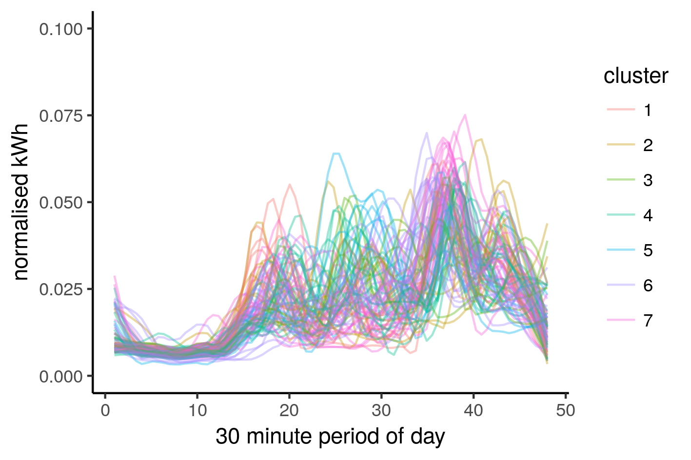
There is a lot going on in the above image, but there seems to be some dominant clusters, or rather, non small clusters. We can filter the data based on the cluster size, we’re only interested in large clusters, or rather, clusters that aren’t small:
filtered <- norm_long %>%
  group_by(cluster) %>%
  mutate(size = n()) %>%
  ungroup() %>%
  mutate(size = 100*size/n(), # size is % of total the cluster represents
         cluster = as.character(cluster)) %>%
  mutate(significance = if_else(size < 20, "unusual day", 'normal day'))
# 20 could be considered zealous, you can play around with this number

# for convenience
n_insig <- length(which(filtered$significance == "normal day"))

filtered %>%
  filter(significance == "normal day" ) %>%
  ggplot(aes(y = n_kWh, x = rep(1:48,n_insig/48), group = Day, colour = cluster)) +
  stat_smooth(method="loess", se=FALSE, span=0.2, geom="line", alpha=0.3) +
labs(x = "30 minute period of day", y = "normalised kWh") |
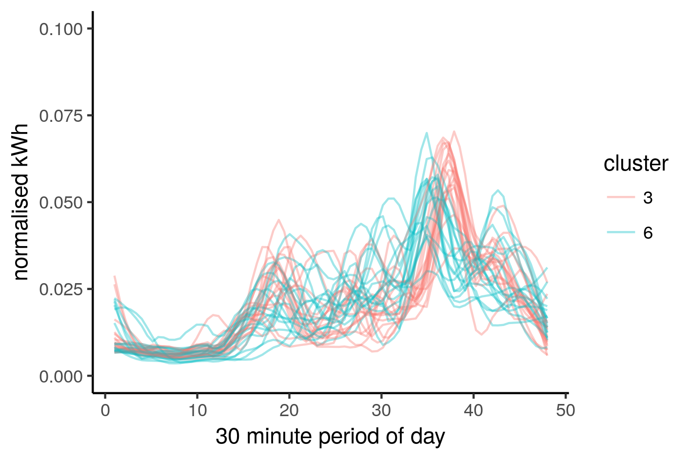
We have managed to capture only the ‘typical’ behaviour of this household. Let’s look at this in terms of ribbons instead of strings
filtered %>%
  group_by(Period, significance) %>%
  summarise(mean_n_kWh = mean(n_kWh),
            sd_n_kWh = sd(n_kWh)) %>%
  ungroup() %>%
  mutate(lw_sd_n_kWh = mean_n_kWh - sd_n_kWh,
         up_sd_n_kWh = mean_n_kWh + sd_n_kWh,
         Period = as.numeric(Period)) %>%
  arrange(significance, Period) %>%
  ggplot(aes(y = mean_n_kWh, x = Period)) +
  geom_ribbon(aes(ymin = lw_sd_n_kWh, ymax = up_sd_n_kWh, fill = significance),
              alpha = 0.4,
              linetype = 0) +
labs(x = "30 minute period of day", y = "mean normalised consumption") |

The filtered or “normal” ribbon is more defined than the “unusual” ribbon, this is what we want. Our filter has essentially kept the red portion and discarded the blue, giving us a more “pure” representation of a househol’d consumption.
Applying filter to all households
We can generalise the code by simply applying a for loop, then concatenating the results. This will give us a dataframe containing only filtered household consumption profiles. Then we can apply the k-means clustering algorithm to calculate the overall consumption profiles.
norm_wide_all <- data.frame()
for (household in unique(df$ID)) {
norm_wide <- df %>%
filter(ID == household) %>%
group_by(ID) %>%
mutate(Day = rep(1:(n()/48), each=48),
Period = rep(1:48, n()/48)) %>%
group_by(Day) %>%
mutate(n_kWh = kWh/sum(kWh)) %>%
ungroup() %>%
select(n_kWh, Period, Day) %>%
spread(key = Period, value = n_kWh) %>%
na.omit()
# filter small samples
if (nrow(norm_wide) &amp;lt;= 10) {break}
clusters <- norm_wide %>% select(-Day) %>% kmeans(10, algorithm = c("MacQueen"),
iter.max = 100) #MacQueen
norm_long <- norm_wide %>%
mutate(cluster = clusters$cluster) %>% # this will confuse someone one day
gather(Period, n_kWh, -c(Day, cluster)) %>%
arrange(Day) %>%
select(Day, Period, n_kWh, cluster)
filtered <- norm_long %>%
group_by(cluster) %>%
mutate(size = n()) %>%
ungroup() %>%
mutate(size = 100*size/n(),
cluster = as.character(cluster)) %>%
filter(size >= 15)
norm_wide_one <- norm_wide %>%
filter(Day %in% unique(filtered$Day))
norm_wide_one$ID <- household
norm_wide_all <- rbind(norm_wide_all, norm_wide_one)
} |
Applying k-means to these filtered household energy profiles. We arbitrarily use 10 clusters, we’ll filter out the insignificant clusters.
cl_norm_wide_all <- norm_wide_all %>%
  select(-Day, -ID) %>%
  kmeans(10, iter.max = 100)

norm_long_all <- norm_wide_all %>%
  mutate(cluster = as.character(cl_norm_wide_all$cluster)) %>% # this will confuse someone one day
  gather(Period, n_kWh, -c(Day, cluster, ID)) %>%
  arrange(cluster, ID, Day, as.numeric(Period)) %>%
  select(ID,Day, Period, n_kWh, cluster) %>%
  group_by(cluster) %>%
  mutate(size = n()) %>%
  ungroup() %>%
  mutate(size = 100*size/n(),
         cluster = as.character(cluster)) %>%
filter(size >= 10) |
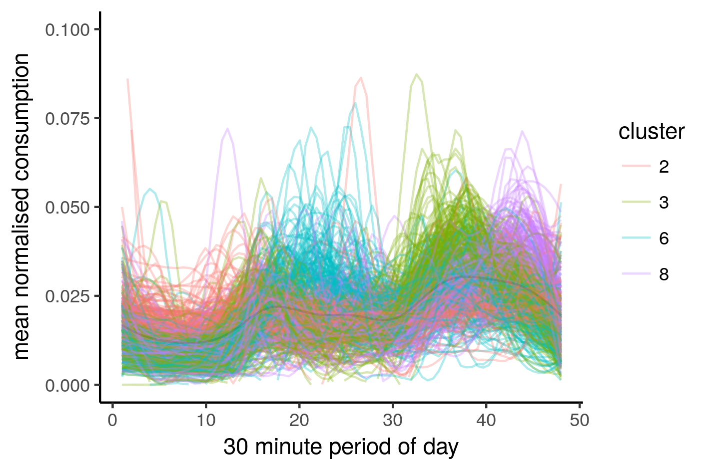
Now for the psychedelic images. These are our main consumption profiles.
norm_long_all %>%
  ggplot(aes(y = n_kWh, x = rep(1:48,nrow(norm_long_all)/48))) +
  stat_smooth(method="loess", se=FALSE, span=0.2, geom="line", alpha=0.3,
              aes(colour = cluster, group = interaction(cluster,ID))) +
  labs(x = "30 minute period of day") +
  ylim(0, 0.06) + theme_bw() + theme(panel.border = element_blank(), panel.grid.major = element_blank(),
                                     panel.grid.minor = element_blank(),
                                     legend.position="none",
axis.line = element_line(colour = "black")) + guides(fill=FALSE) |
I think this looks better than the previous post
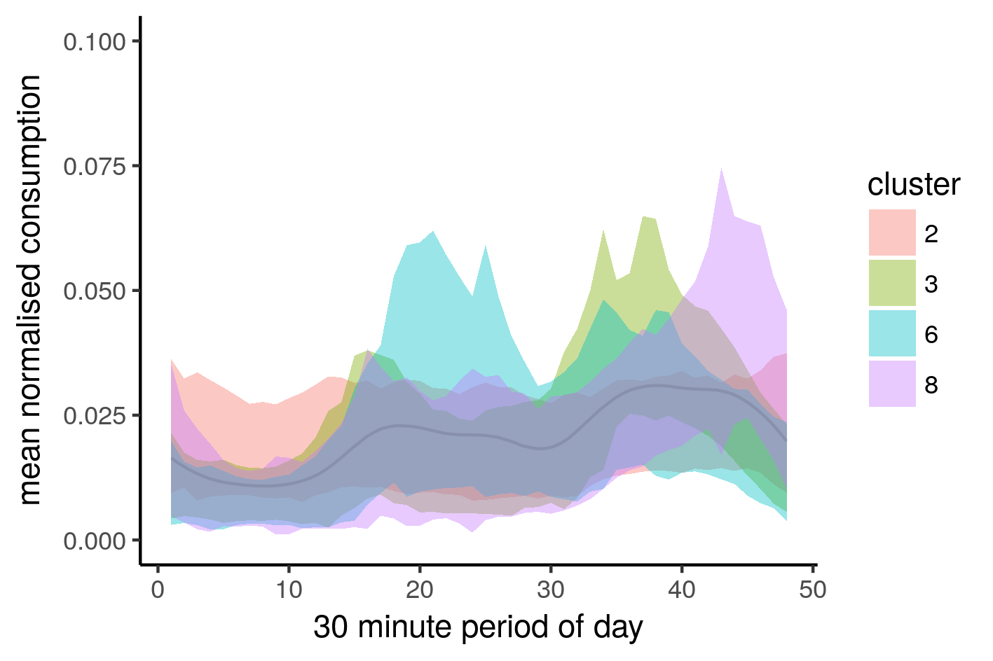
norm_long_all %>%
  group_by(cluster, Period) %>%
  summarise(mean_n_kWh = mean(n_kWh),
          sd_n_kWh = sd(n_kWh)) %>%
  ungroup() %>%
  mutate(lw_sd_n_kWh = mean_n_kWh - sd_n_kWh,
         up_sd_n_kWh = mean_n_kWh + sd_n_kWh,
         Period = as.numeric(Period)) %>%
  arrange(cluster, Period) %>%
  mutate(cluster = as.character(cluster)) %>%
  ggplot(aes(y = mean_n_kWh, x = Period)) +
  geom_ribbon(aes(ymin = lw_sd_n_kWh, ymax = up_sd_n_kWh, fill = cluster),
              alpha = 0.4,
              linetype = 0) +
labs(x = "30 minute period of day", y = "mean normalised consumption") |
Let’s see what it looks like with the ribbons. We include the average of all of them (dark line)
Another less sophisticated method for filtering outlier days is to use the aggregated median of household consumption.
I would be interested to hear how this is applied in other contexts. That’s all for today, I hope you enjoyed this post.