With the advent of domestic photovoltaic electricity production, and now battery storage there is increasing awareness of when electricity is used rather than how much electricity is used. Formerly, the latter was the only determinant factor on cost of electricity, now with solar there is a mitigating when factor. With the addition of battery storage, it is technically possible to disconnect one’s home from the grid, avoiding all costs associated with usage.
Having tools to analyse electricity consumption allows one to determine weather or not there is a financial incentive to installing solar and/or battery. In this post we will use R to do build some simple statistical descriptions of sample smart meter data, in following posts we’ll go through some more advanced calculations.
We’ll be using data from data.london.gov.uk that contains 30 minute resolution consumption records from thousands of households. We can download it directly from within R.
url <- "https://files.datapress.com/london/dataset/smartmeter-energy-use-data-in-london-households/Power-Networks-LCL-June2015(withAcornGps).zip"
download.file(url,destfile = "data/data.zip",mode = "wb", method="wget")
unzip("data/data.zip","data/data.csv") # alternatively unzip manually
df <- read.csv("data/data.csv",nrows=10000) |
For simplicity, let’s look at just one household for the moment, and we’ll use the dplyr library which makes the code more readable. We surround all our date fields in lubridate functions to keep the timezone consistently UTC, and let’s only consider a non leap year.
library("dplyr")
library("lubridate")
df1 <- df %>% filter(LCLid=='MAC000002') %>% # random premise
transmute(DateTime = ymd_hms(DateTime),
kWh = (KWH.hh..per.half.hour.)) %>%
filter(DateTime &amp;amp;gt; ymd('2012-12-31'),
DateTime &amp;amp;lt;= ymd_hms('2014-01-01 00:00:00')) |
Let’s go through the above code block. Smart meters sum the previous 30 minutes (or other interval) of power. This means that for the year 2013, the first measurement occurs at 12:30 AM (00:30), and the last measurement for the year is taken at 12:00 AM the following year. Let’s take look at the head and tail of this dataframe:
head(df1)
             DateTime   kWh
1 2013-01-01 00:30:00 0.241
2 2013-01-01 01:00:00 0.191
3 2013-01-01 01:30:00 0.235
4 2013-01-01 02:00:00 0.182
5 2013-01-01 02:30:00 0.229
6 2013-01-01 03:00:00 0.194 |
tail(df1)
                 DateTime   kWh
17527 2013-12-31 21:30:00 0.451
17528 2013-12-31 22:00:00 0.456
17529 2013-12-31 22:30:00 0.402
17530 2013-12-31 23:00:00 0.491
17531 2013-12-31 23:30:00 0.452
17532 2014-01-01 00:00:00 0.496 |
This is now essentially a time series object. Before I carryout any descriptive statistics on the data, I’ll need to clean it. I found that the numerical column actually contains white space. This causes the entire column to be read as a character vector. Let’s fix this by swapping out the white space with no space and converting the field to a numerical type. While we’re at it we’ll remove a dozen duplicated records that found there way into the data:
df1$kWh <- as.numeric(gsub(' ','',df1$kWh))
df1 <- df1[!duplicated(df1),] |
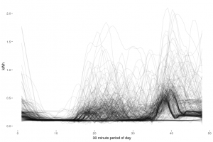
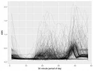
I usually like to visualise my data at this point, in any case, I need a nice image for the top of the page.
ggplot(data = df1, aes(y = kWh,x=rep(1:48,365),group=date(DateTime))) + stat_smooth(method="loess",se=FALSE,span=0.2,geom="line",alpha=0.1) + labs(x = "30 minute period of day") |
Nice spaghetti plot. This image illustrates 365 days of electricity usage, at a resolution of 48 half-hour intervals. This household exhibits considerable usage during the middle of the day, suggesting a daytime presence at the house e.g. retiree, or family perhaps. Note that we haven’t accounted for daylight savings in the data, this may explain the splitting of the profile towards the end of the day.
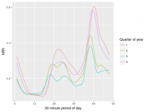
The ggplot2 library is very powerful, we can alter the above code to visualise the average usage by quarter:
ggplot(data = df1, aes(y = kWh,x=rep(1:48,365),color=as.factor(quarter(df1$DateTime)))) + stat_smooth(method="loess",se=FALSE,span=0.2,geom="line",alpha=0.7) + labs(x = "30 minute period of day", color="Quarter of year")+ |
Indeed, this household appears to use more electricity in the colder quarters, this could be due to electric heating.
We can otherwise use the summary command to calculate basic statistics:
summary(df1$kWh) Min. 1st Qu. Median Mean 3rd Qu. Max. 0.0650 0.1100 0.1500 0.2406 0.2620 2.9940 |
The max consumption is ~3 kWh in a 30 minute period. This shouldn’t present any problems as far as peak usage for a battery. The Tesla Powerwall specifies a peak output of 7kW. This figure is instantaneous however, so unless this household has a habit of using their electric kettle, toaster, iron, and vacuum simultaneously, there shouldn’t be a problem.
Let’s look at the summary statistics aggregated at a daily level:
dfDaily <- df1 %>% group_by(day_of_month = date(DateTime)) %>% summarise(kWh = sum(kWh)) dfDaily # A tibble: 366 x 2 day_of_month kWh <date> <dbl> 1 2013-01-01 10.6 2 2013-01-02 13.3 3 2013-01-03 10.1 4 2013-01-04 9.86 5 2013-01-05 11.2 6 2013-01-06 10.3 7 2013-01-07 9.44 8 2013-01-08 11.6 9 2013-01-09 15.3 10 2013-01-10 10.7 # ... with 356 more rows |
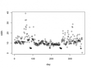
If we plot this, we should see the increased usage in the colder months (or decreased usage in the warmer months). We can use our handy summary function too:
plot(dfDaily$kWh, xlab = "day", ylab = "kWh") summary(dfDaily$kWh) Min. 1st Qu. Median Mean 3rd Qu. Max. 0.496 8.961 10.662 11.516 12.913 39.284 |

There are some big days in there, this is the sort of data one needs if they’re considering an alternative energy solution. If a household is consuming >30 kWh, and wanted to go off-grid, they would need to understand when they used the bulk of that electricity. This informs the decision about buying a bigger battery, or a bigger solar PV array.
To that end, let’s see which hour of the day typically consumes the most electricity:
df1 %>%
  group_by(period_hour = hour(DateTime)) %>%
  summarise(mean_kWh = mean(kWh)) %>%
  filter(mean_kWh == max(mean_kWh))
# A tibble: 1 x 2
  period_hour mean_kWh
        <dbl>    <dbl>
1 19 0.487 |
That’s seven o’clock in the evening. There isn’t a lot of sun in London on the best of days, there’s a lot less at this time of day. For this household to go off-grid, a big battery is the way to go.
We’ll finish up this introduction to smart meter analytics with R. Although we only scratched the surface of the analytics opportunities with smart meter data, I hope it’s clear that understanding data is key to making better decisions. In the next post we’ll go through processing thousands of households.


